Designing an Interface for Dolby as Quickly as Possible
Summary
The challenge. The ask.
Intelygenz asked me to create an app concept for Dolby featuring a catalogue of videos to aid their sales force in promoting their new and innovative Dolby Atmos technology.
The goal of the project was to develop a user-friendly interface that was both high-performing and consistent with the Brand Book guidelines.
The project was given a month to complete, so I decided to divide it into four weeks with specific tasks. The first week focused on information architecture, the second on workshops and lo-fi prototyping, the third on direct UI design, and the final week on user testing and final approval of the project outcome.
To design an app in the most lightweight way possible.
Understand.
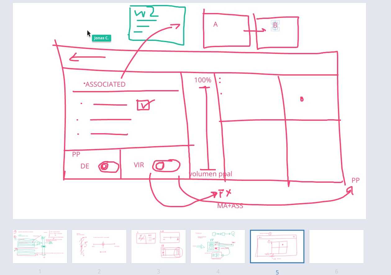
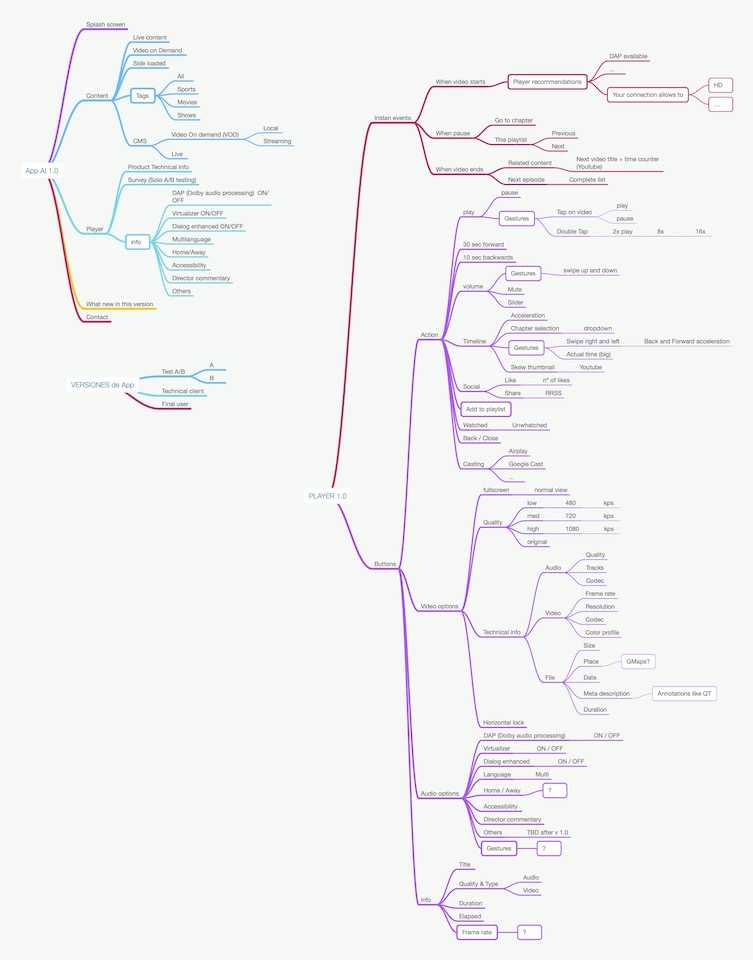
So, in this project, I came up with a heuristic approach that prioritized speed. We skipped the traditional research and wireframing stages, but we did create an information architecture using Mindnode. This helped us with the Functional Development Analysis and made it easier for the client to approve.
So I started exploring and did some benchmarking of interaction patterns that were captured in a moodboard. This helped me find the ones that would work best for Dolby’s salespeople.
Think.
It seems that designing for mobile or desktop was not a priority because the sales representatives primarily used tablets for Dolby product demos. To address this, you proposed setting up a lightweight design system that could quickly deliver designs to front-end developers and communicate asynchronously with stakeholders.
The system would be based on Sketch (The Design System was already created using this tool) for designing, Zeplin for handoff to developers, and Invision for communicating with Dolby’s client and stakeholders and conducting RUTs.
Material Design
To go very fast, we use Material Design libraries as the basis for native front-end development for both Android and iOS. This allows us to have pre-built components that we can customize in Sketch to adapt them to Dolby’s brand book.
Solve.
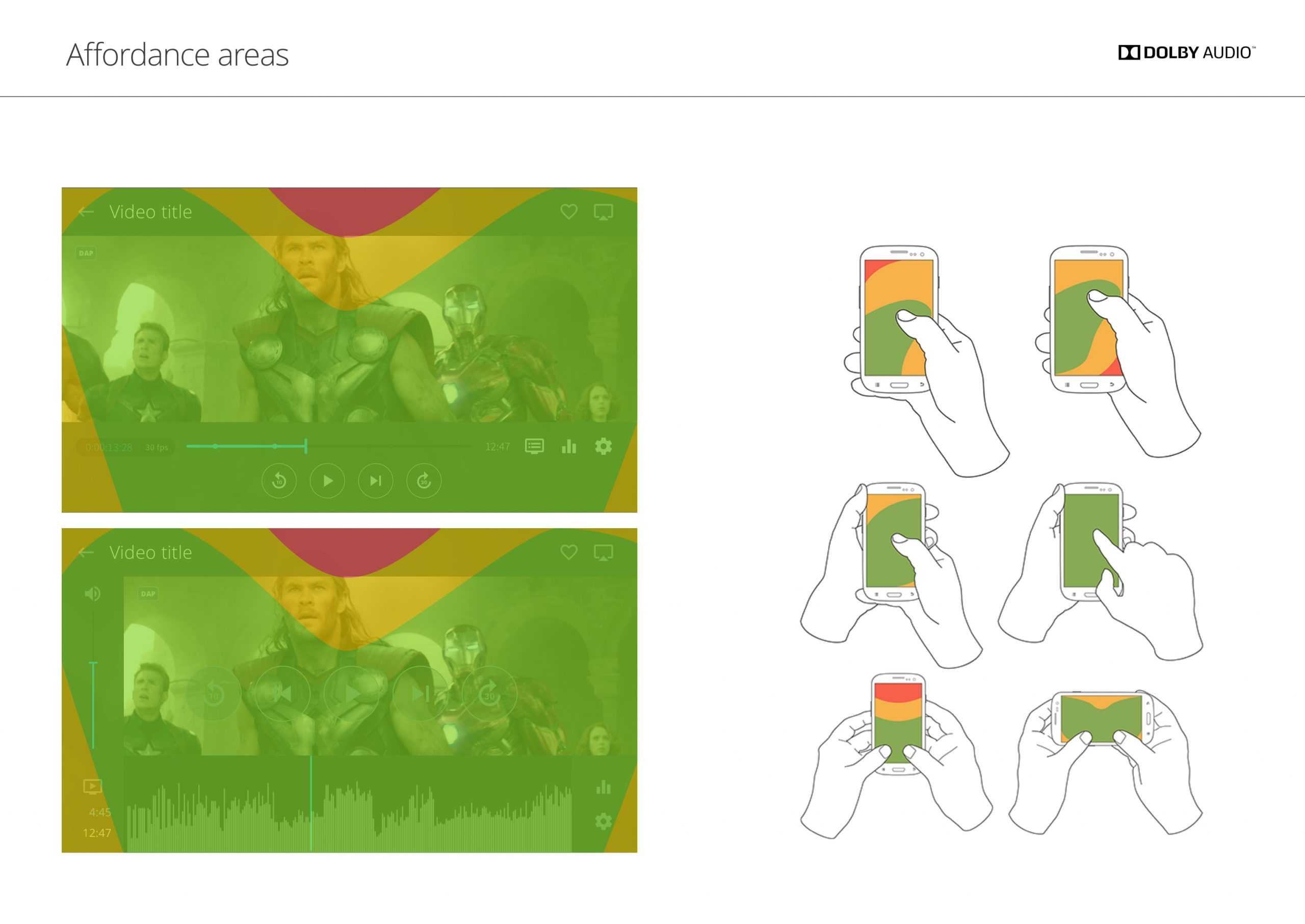
Visual Design
We began the design process by creating the tablet version first in order to quickly collaborate with the commercial team. Following that, we proceeded with the mobile version and eventually the desktop version.
Learn.
When we had everything designed and iterated with the development and client team, we prepared a quick A/B test and a lightweight RUT to discover which of the finalist design options were the most usable.
The test subjects were Dolby’s own salespeople.

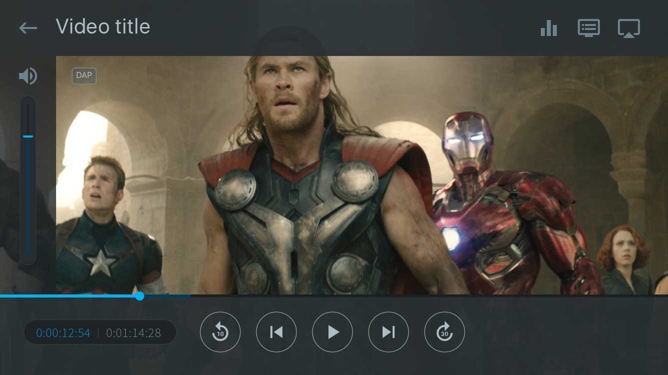
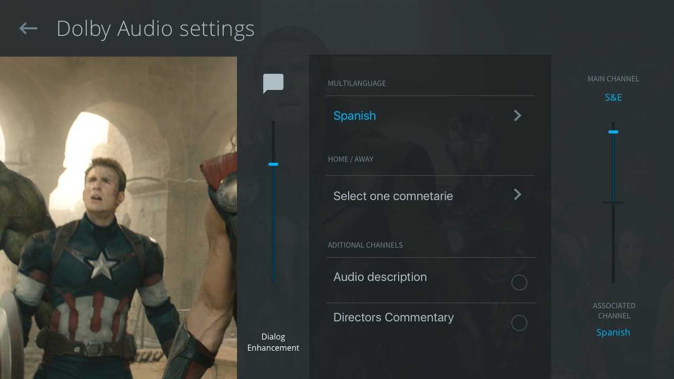
This is a visual summary of the work done for Dolby.