Developing the aesthetics for Bolster, a company on the rise.
Role
Services
Summary
The challenge. The ask.
Context
The Bolster management team contacted me to help them improve their identity, create a solid brand foundation, help design a brand strategy, build digital items of any type, and make a design system illustration framework.
After several meetings and inception sessions, we created a plan to achieve our objectives. This plan included progressive collaboration over a period of three months with renewable contracts, focused on results. We followed this plan for approximately one year.
John Ledwidt created an excellent logo, which served as the starting point for a simple style guide.
The team I was going to join consisted of a technical leader, several engineers, a UI/UX duo, marketing and business personnel. I had to report to the Head of Product and the CEO, who had the final say on the strategic decisions related to my work.
I divided the project into three stages: initial research, planning, and the most time-consuming stage, just getting it done.
Understand
Do Some Research
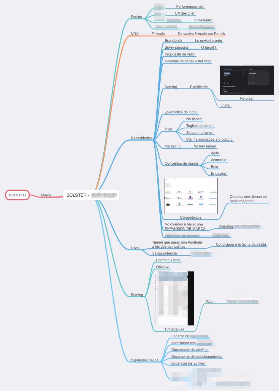
The first stage’s goal was to collect as much important info as possible about the product, its identity, the company’s vision, and the OKRs that guide everyone. We held Inception sessions to figure out:
-
What solution Bolster offers the world and how its future users benefit.
-
How the brand is expressed and how it stands out compared to its competition.
-
Who we were designing for.
-
Who and how each of the components of the Startup are.
Think and plan
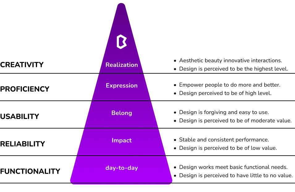
In the second part, our goal was: to come up with a plan to evolve the Bolster brand visually and figure out how to make it happen.
The plan was straightforward: make a list of all the design needs, and work with the management team to plan and prioritize each item. We split it up into monthly goals, and reviewed it every 3 months.
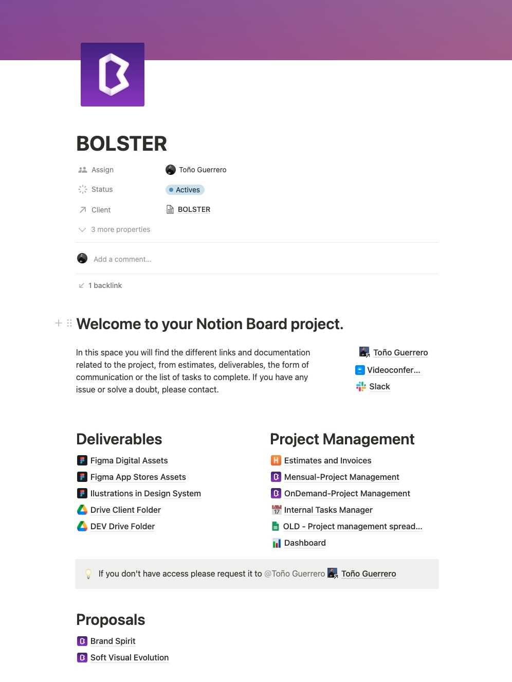
We worked in a kanban model with a time & materials backlog to meet our objectives. Every month, we talked to the Head of Product about which deliverables we had to make, in what order, and with what instructions.
I assembled small, on-demand teams of a few people to achieve goals and deliver results.
Solve and design
Improving the logo digitally
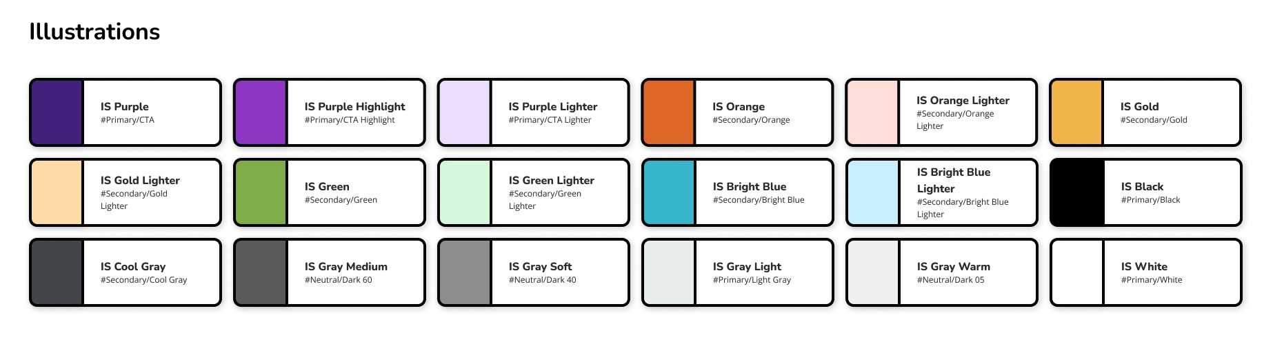
Logo We made sure the identity was ready for digital use from the start, since the initial design was mainly for graphics and physical designs. We changed the colors and gradients so they had more contrast on any kind of screen.

Brand Visual Moodboard
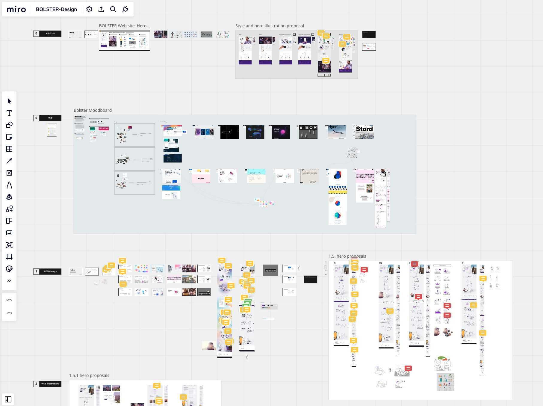
Analyze the competition visually. We also look at different design styles and figure out how to connect them to the brand values without creating discord with the existing Design System.
Creative concepts proposed
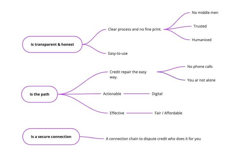
After following the previous steps and conducting workshops with the team, we concluded that, graphically, we would choose one of these three paths of visual significants of Bolster to feed the Branding.
-
Bolster is transparent and honest.
-
Bolster is the path to financial health.
-
Bolster is a secure connection to improve your credit score.
Looking into different styles
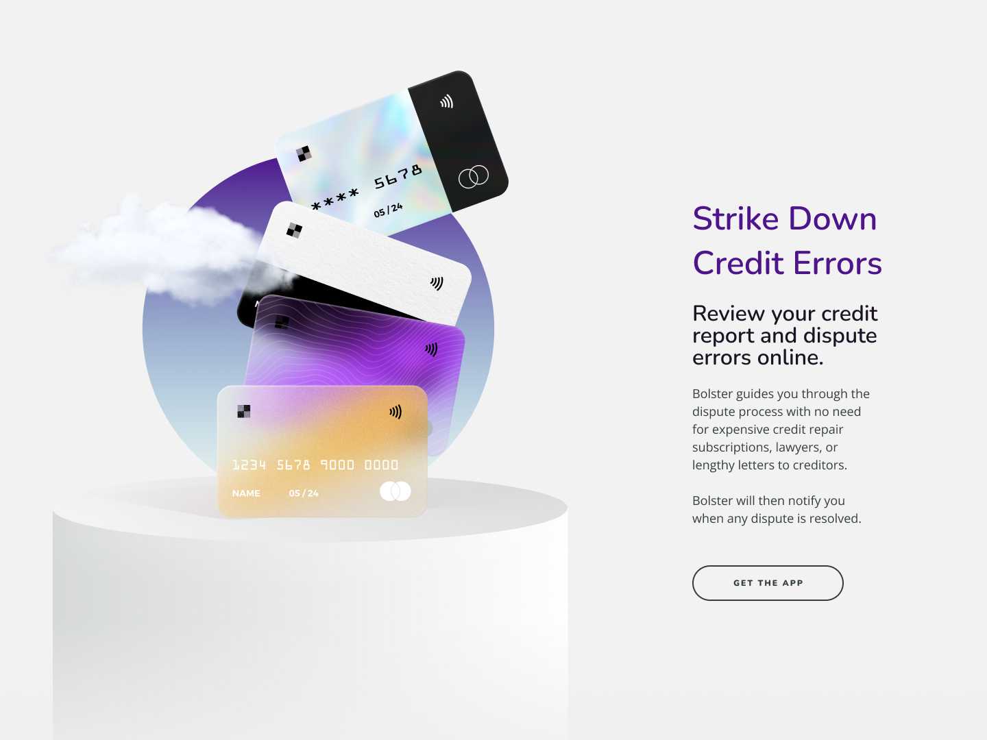
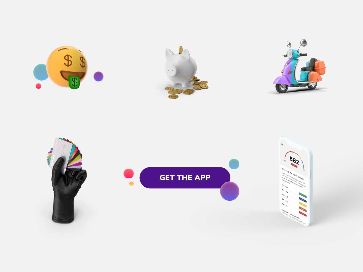
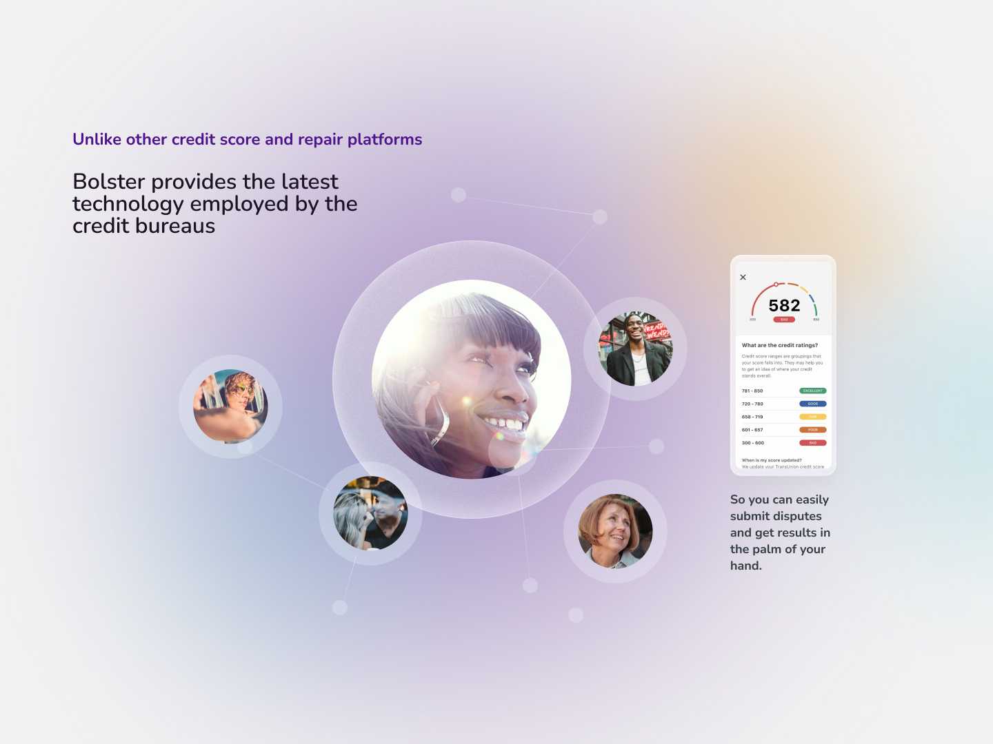
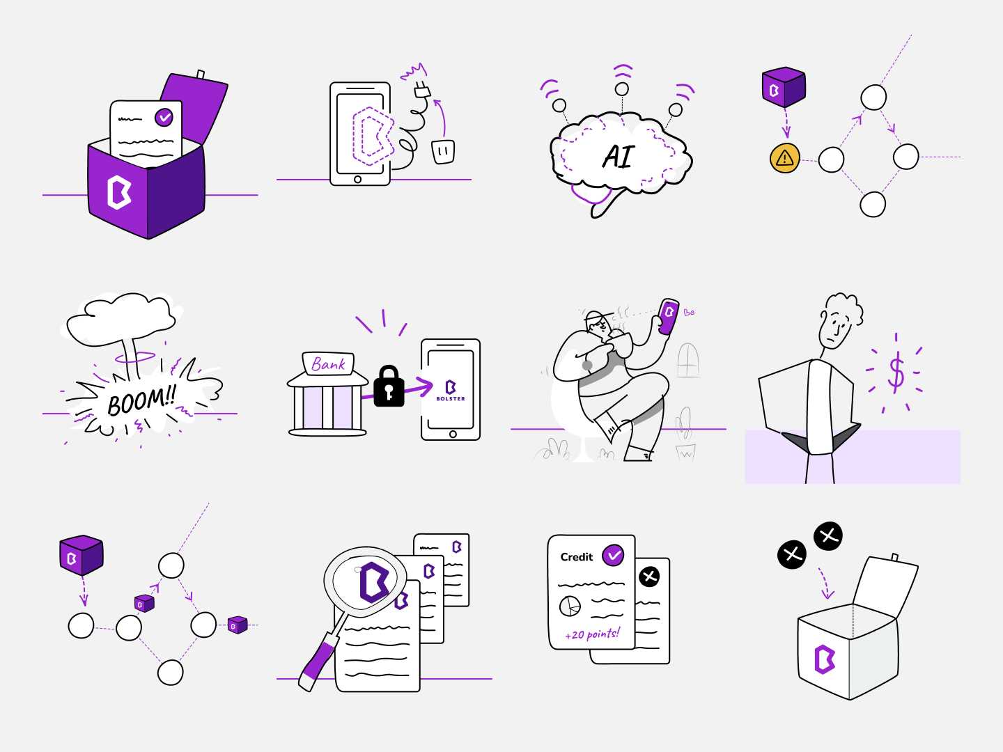
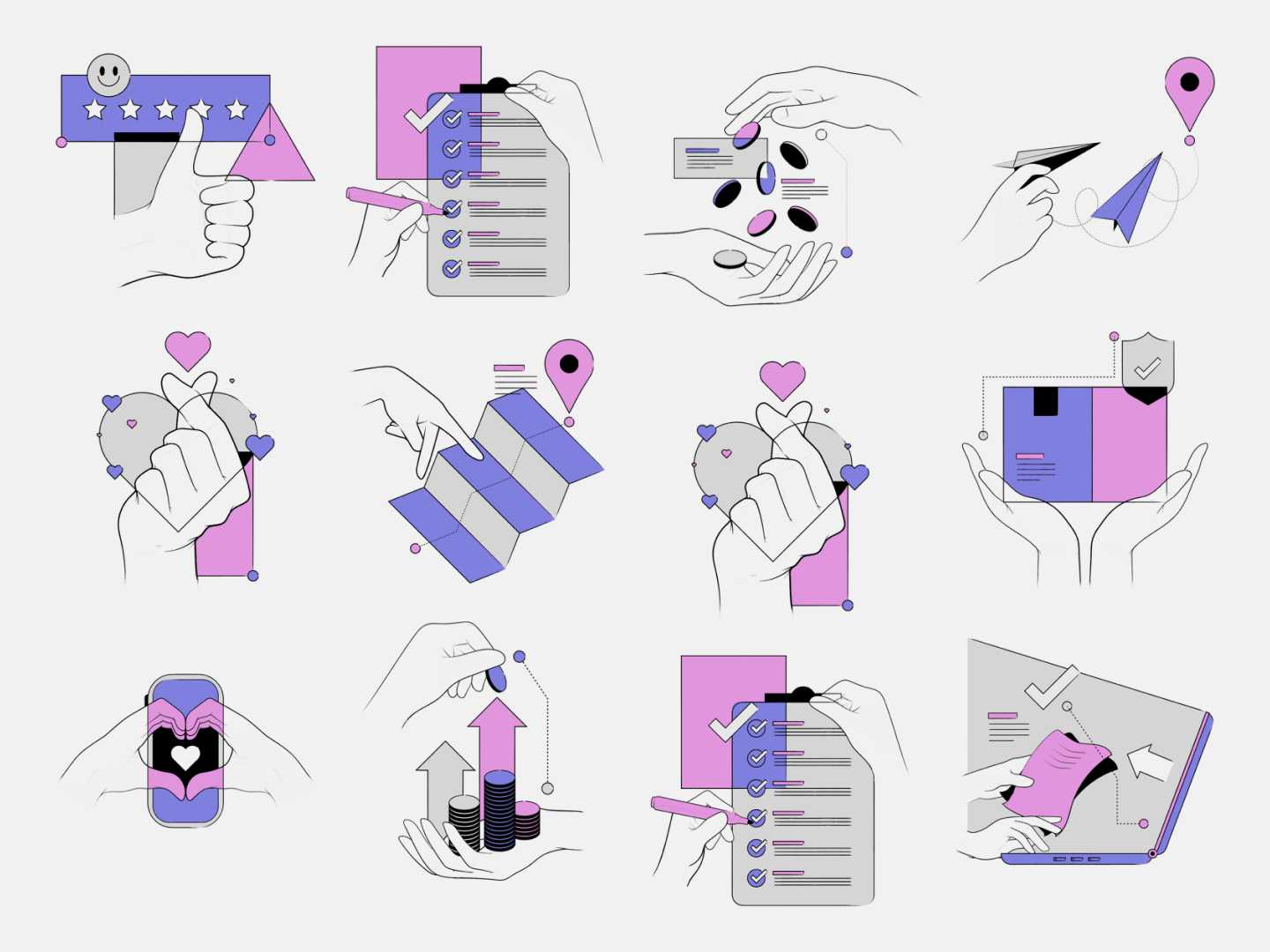
For a while, we try a lot of ideas and graphic styles. We tried out different designs that combined 3D real-time illustrations, video animations, isometric graphic design and doodle illustrations.
↑ Try to slide the phone. Use two fingers to move it 😁.

Conclusion
Bolster must stand out as a friendly and distinctive hand drawn brand.
To accomplish it, we will design neutral backgrounds, hand draw to explain complex concepts, and communicate in a straightforward way to achieve it.

Visual Branding
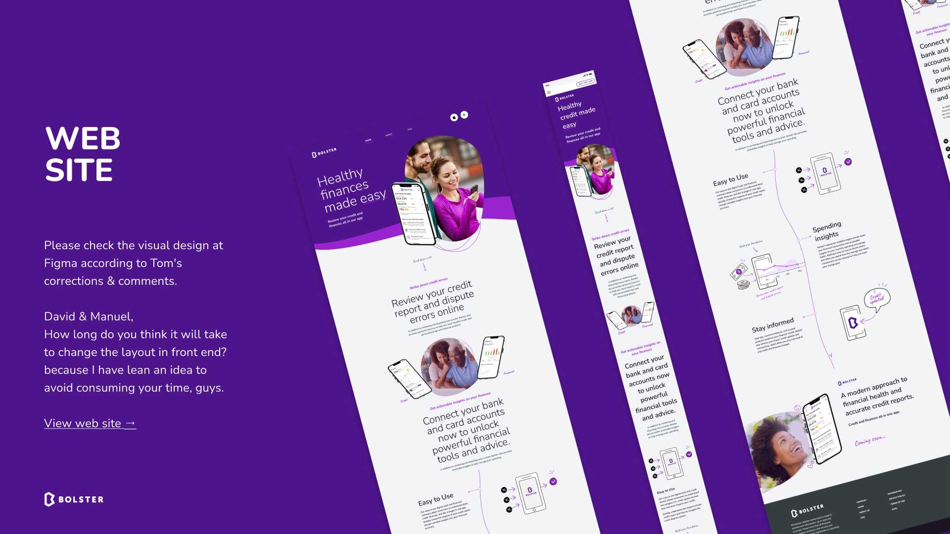
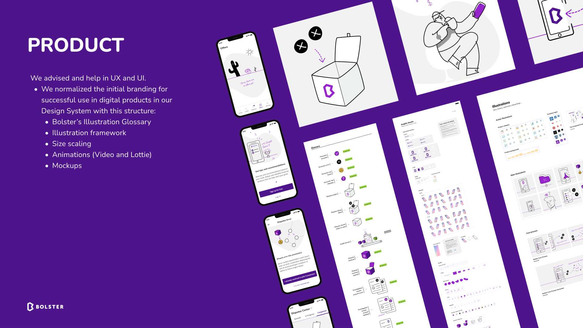
Put all brand visuals into action.
Design System
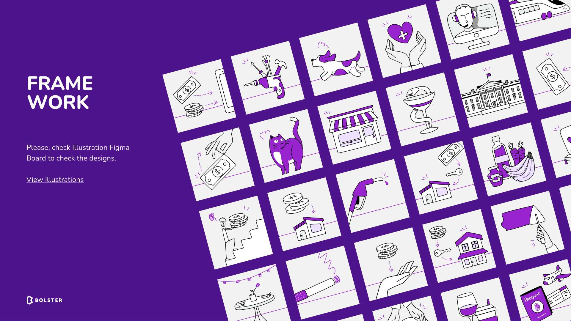
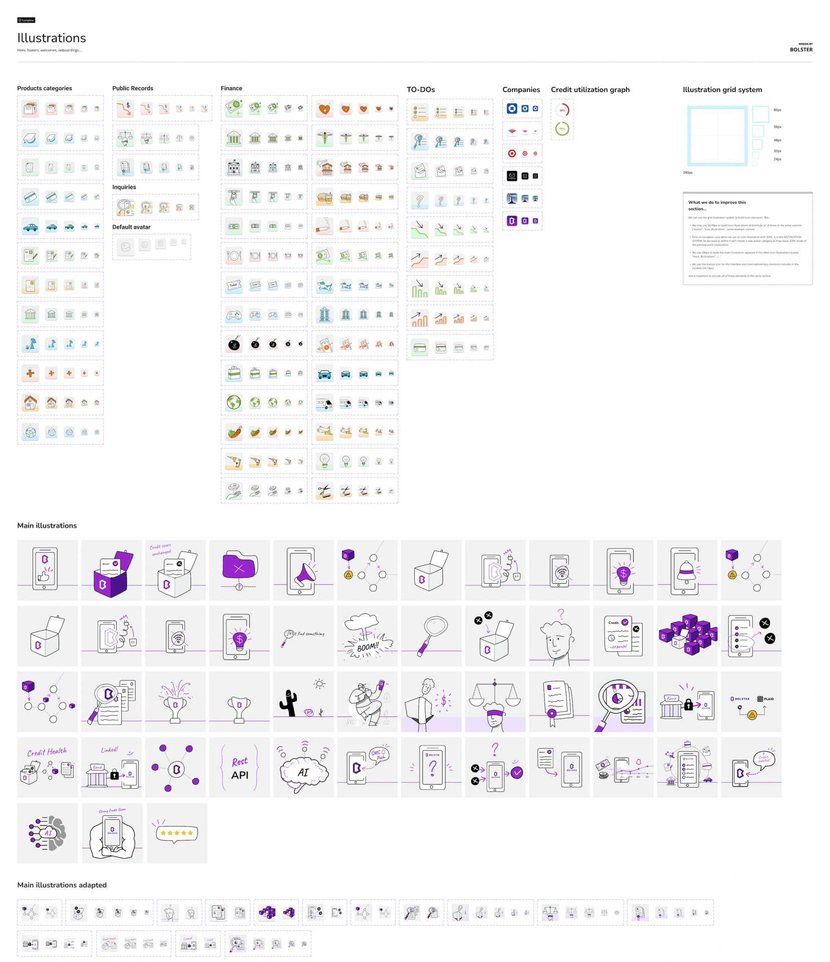
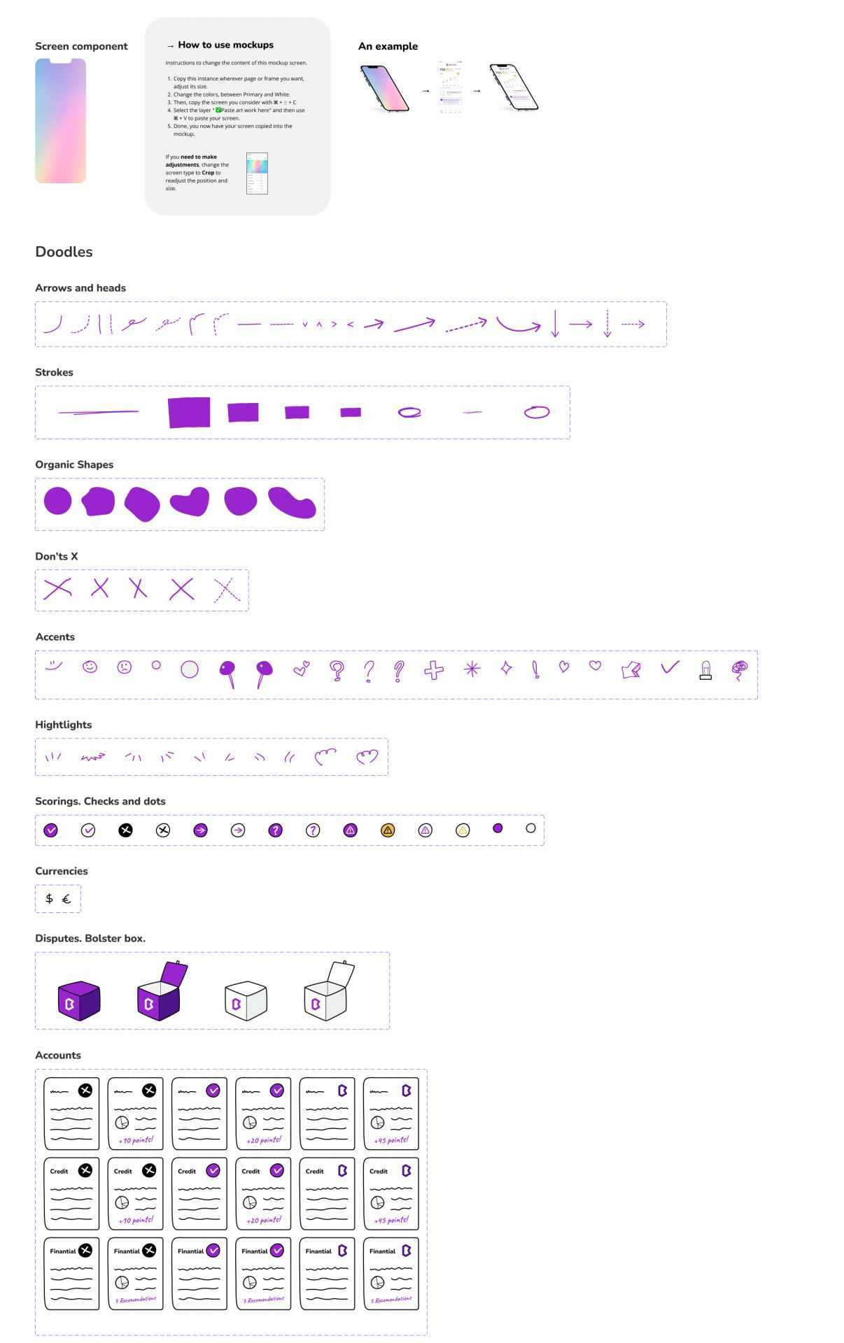
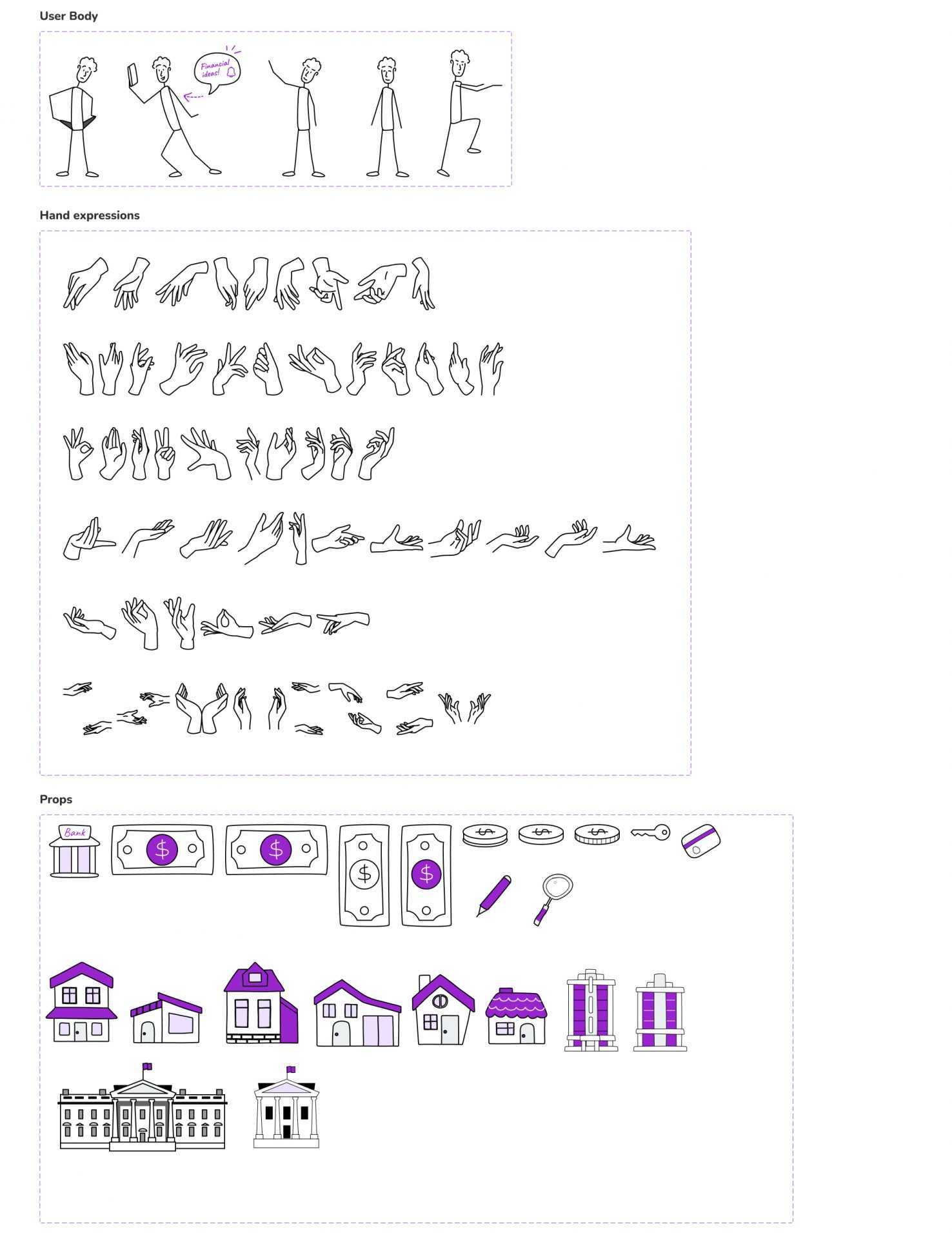
Create the framework for an Illustrations and Icons Design System.
Video & Animation
Producing a video to advertise the Bolster App.
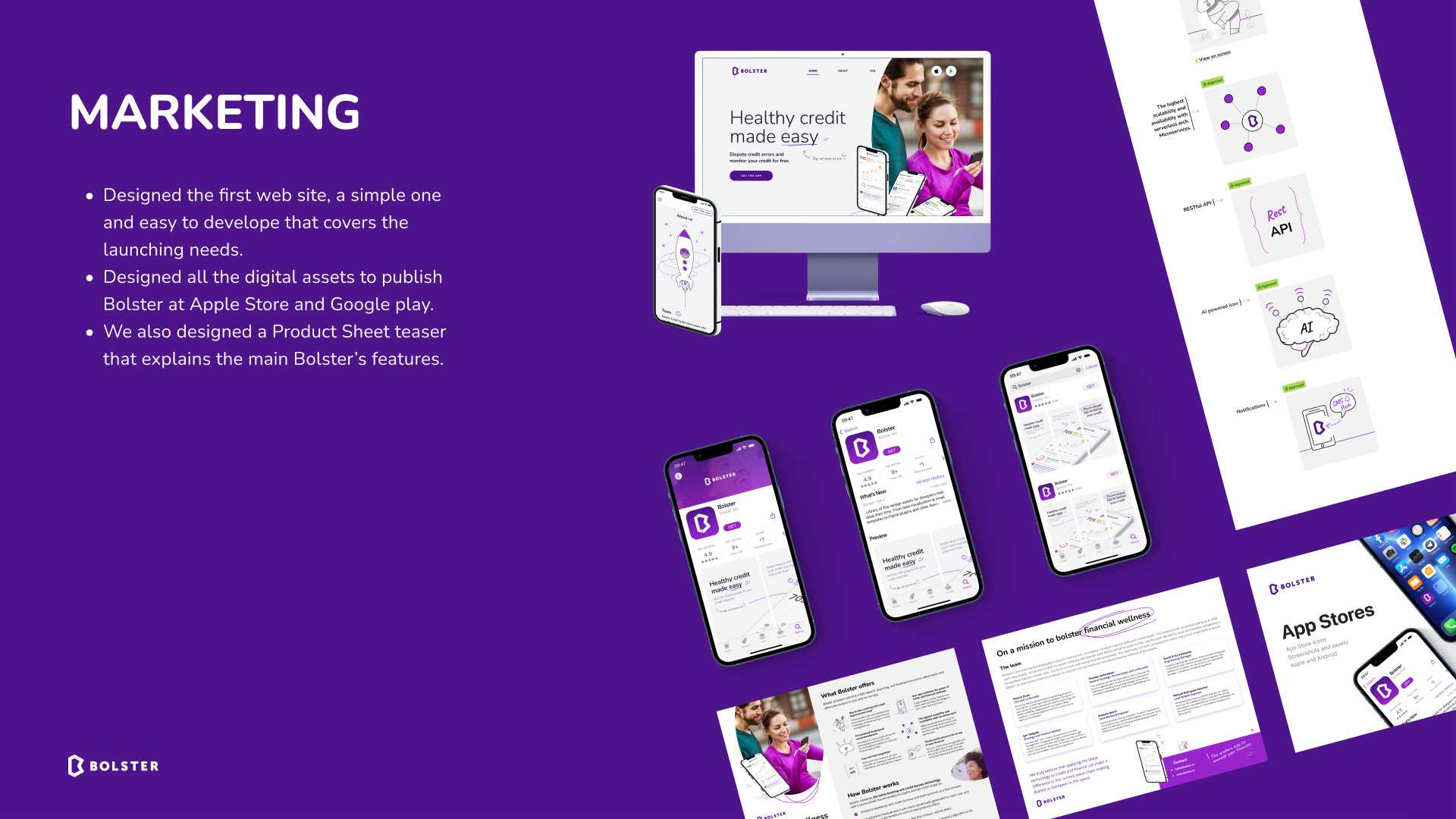
Grow the Brand
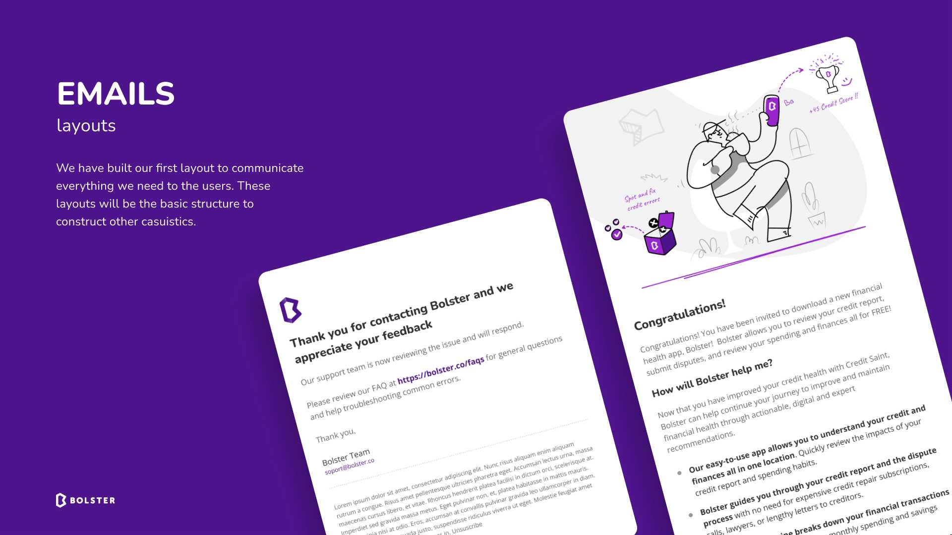
Deploy the brand across ads, app store pages, offline, brochures, social ads…